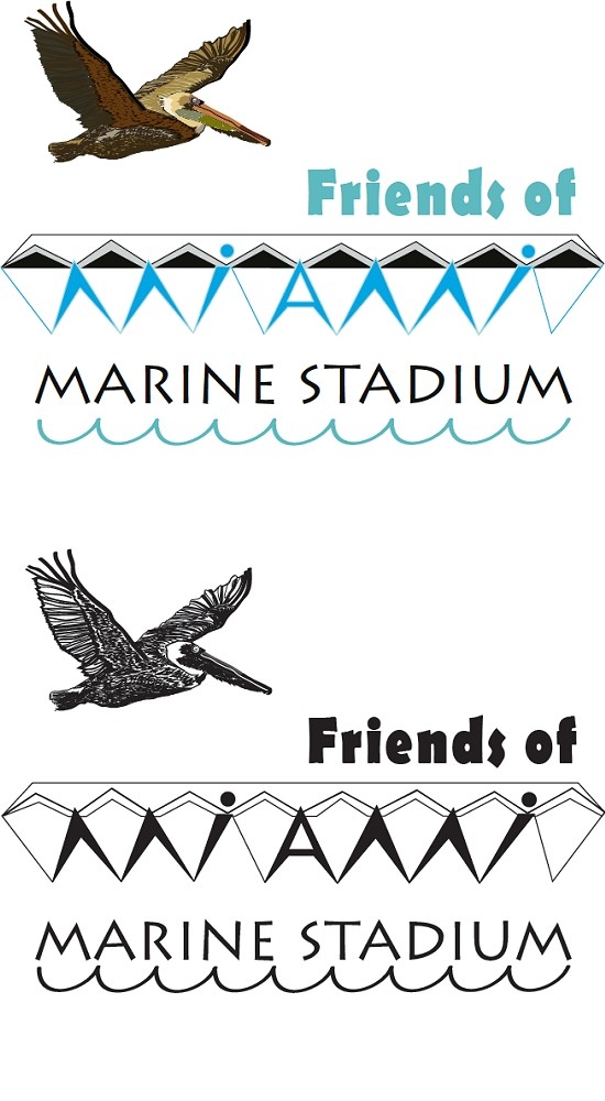
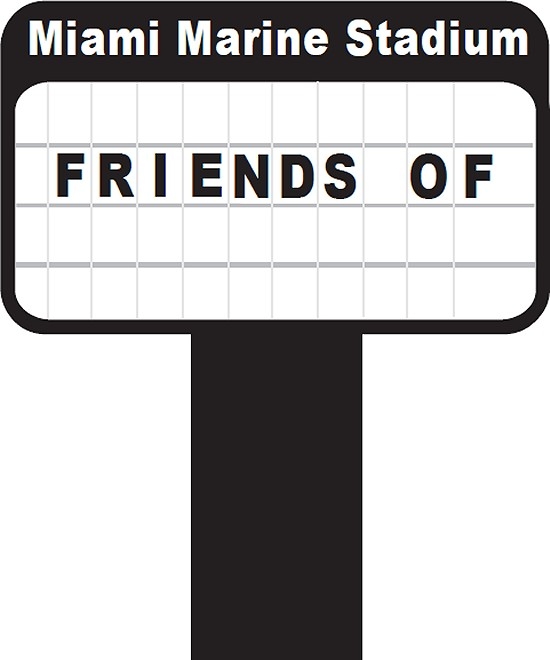
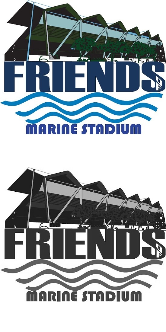
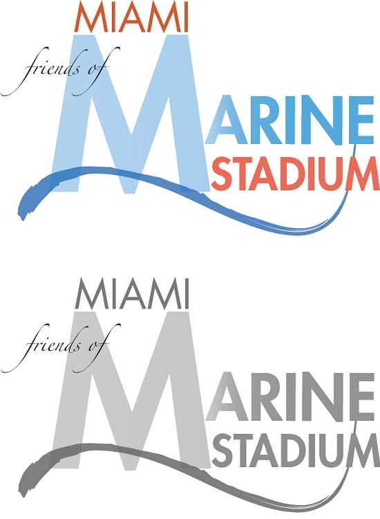
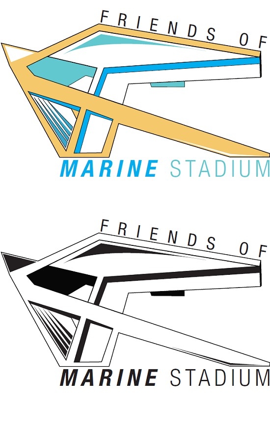
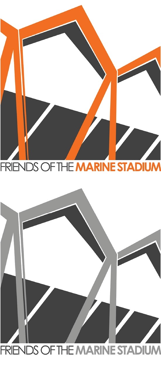
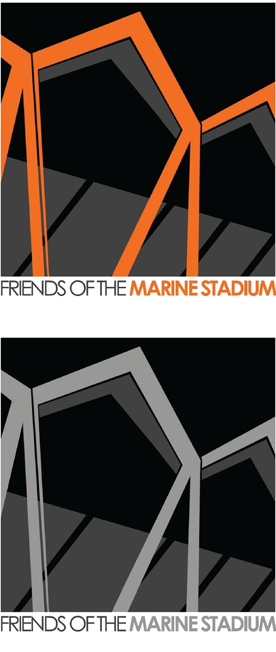
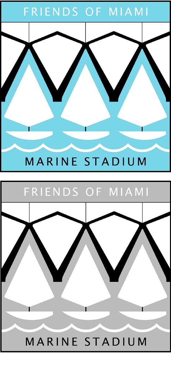
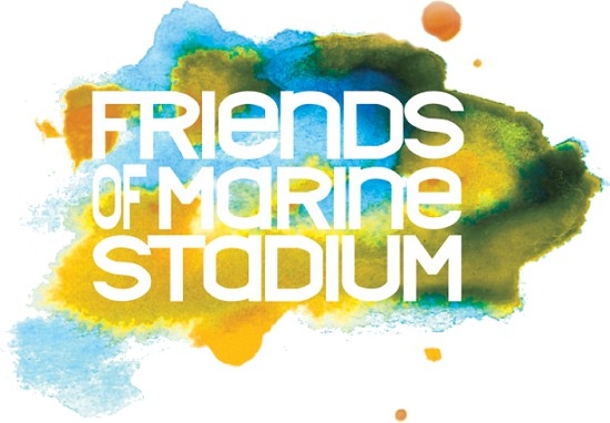
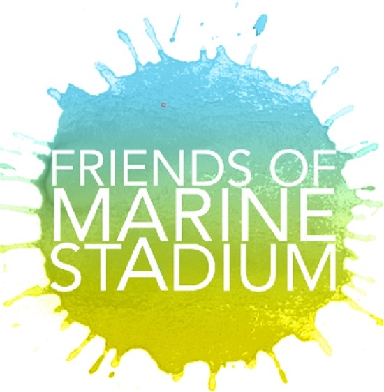
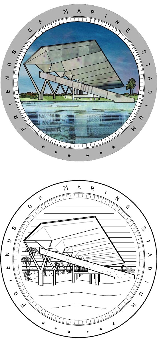
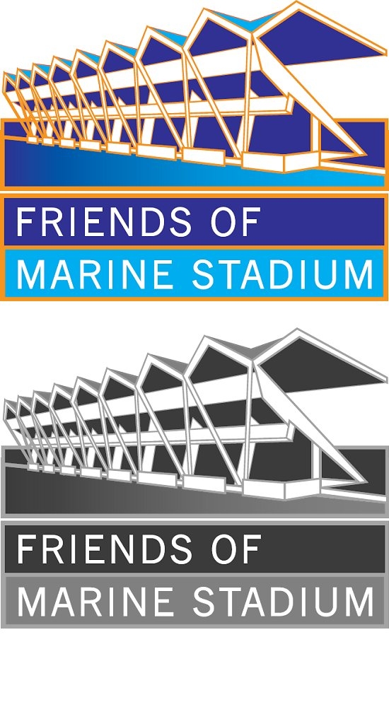
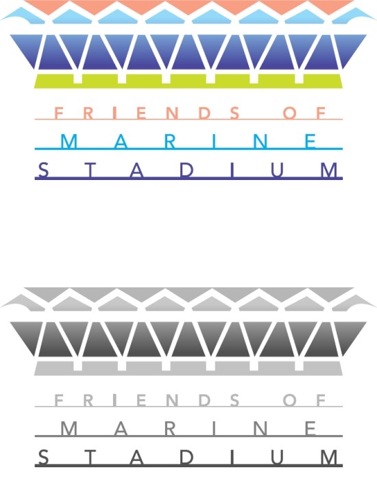
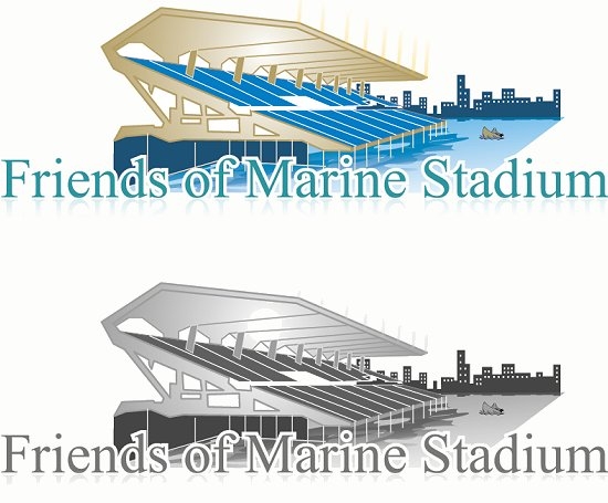
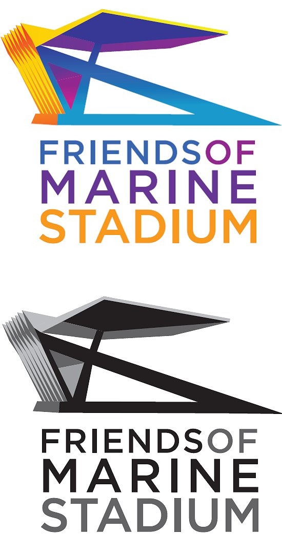
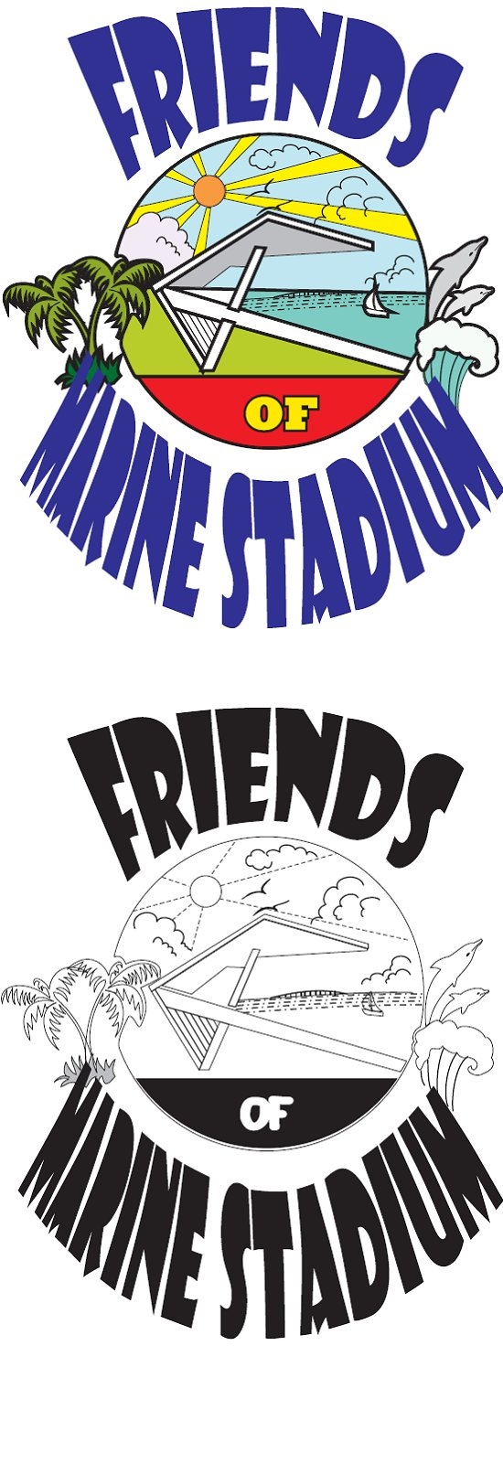
LATEST NEWS IF SEATS COULD TALK MARINE STADIUM MULTIMEDIA CITY OF MIAMI REPORTS LETTERS OF SUPPORT SIGN UP FOR EMAIL UPDATES VIEW ENTRIES FOR LOGO CONTEST

Click here for details.
Below are all of the entries. We will retain them on our website, along with comments of the artists. They are a testament to the creativity that the Marine Stadium inspires.
More logos in PDF file.
Click Here For Larger View
Click Here To Download Hi-Res Color Logo (PDF File)
More logos in PDF file.
Click Here For Larger View
Click Here To Download Hi-Res Color Logo (PDF File)
More logos in PDF file.
Click Here For Larger View
Click Here To Download Hi-Res Color Logo (PDF File)
Click Here For Larger View
Click Here To Download Hi-Res Color Logo (PDF File)
I did some research on the design of the Miami Marine Stadium. One of the main attractions to the building is its architectural aspect. It has a geometric, minimalistic look that catches the eye. In a sense, a modernistic look of the time and for Miami. My design was to convey the simple but amazing geometric shapes of the architecture. The bule color is for the water, the yellow is for the sun.
Click Here For Larger View
Click Here To Download Hi-Res Color Logo (PDF File)
My fondest memories of Miami Marine Stadium are when I hear Ray Charles sing.
I always thought Miami is so lucky with our great weather, and Miami Marine Stadium just took enjoying being outdoors to a whole other level!
I think back then that there was nothing to compare with the uniqueness of the water's edge platform and open air seating with the view of Miami in the distance (uncil probably the Sydney Opera House).
Click Here For Larger View
Back in the late 70's, kids from my high school would climb up and rearrange the letters on the sign to the Stadium. It must have been the bane of somebody's existence because it was always humorous and "dirty"whenever possible (and had to be changed back ASAP!).
I remember going to the beach on saturday mornings and waiting to see what was on the sign as I passed the stadium.
I wanted to incorporate that' but nobody would remember the sign as fondly as I do.
Click Here For Larger View
Many more logos in PDF File
Click Here For Larger View
Click Here To Download Hi-Res Color Logo (PDF File)
This particular design plays with both typography and vector design in a very simple way. The waves with its original and modern design adds to the design of the typography which I think works pretty well. On the other hand, I wanted to stay with the colors of nature, using blue as my main color since we are designing for the ocean. The placement of the words is very simple but yet has deep meaning. The word "stadium" is in capital letters and is holding the other two words, just like a real stadium will do with its audience. In other words, Miami and Marine are both seating under "stadium".
Click Here For Larger View
Born and raised in Miami, I have come to appreciate a lot of its culture, history, and social life. Along this path, certain icons have stood out and expressed just what the city represents. The Marine Stadium has definitely been one of those icons. Admiring its design and structure, I have tried to capture its essence as well as its harmony of form. Keeping its eye catching architectural design, as well as it's present and future renovations in focus, this design artistically expresses both our beautiful city as well as the Marine Stadium. In this deisgn, the City is expressed by its palm tree, sun, sky and water shadowed by the main focal design represented by the Stadium's structural form.
Click Here For Larger View
Click Here To Download Hi-Res Color Logo (PDF File)
I was inspired to enter this contest because I believe the Miami Marine Stadium should be saved and
restored. Every time I drive by it I am struck by its architecture.
I see multiple triangular shapes in the structure of the stadium which is why I used triangles in the logo.
It is a versatile logo that could work in full color or black and white. It can be adapted to be used in
printed, digital or embroidered media.
Click Here For Larger View
Click Here To Download Hi-Res Color Logo (PDF File)
This proposed logo for the for Friends of Marine Stadium is generated out of the structure itself, the many friends that it has, and basic logo principles. To begin, I felt that the logo should be based on the Stadium's iconic facade, as it is a vivid image that grabs one's attention. To make the facade seem friendlier, I seperated the different bays and added "heads," creating little people, or Friends, that appear to be holding hands in unity while allowing their wide stance to create a sense of strength and determination. By the Friends being a large portion of the Stadium in the logo, one could not exist without the other. The text at the bottom was chosen because its strong, confident lines create a solid base but is at the same time fun and friendly. The colors are the colors of the City of Miami's flag.
Click Here For Larger View
Click Here To Download Hi-Res Color Logo (PDF File)
I saw this project as a great opportunity to showcase my ability to create a great logo that truly reflects what the Stadium stands for and what it means to our community.
My approach in designing the logo was pretty simple. I took what was already there-and has been there for decades-made it somewhat abstract still showing its beauty in its architectural shape and applying some details. The type treatment that I wanted to illustrate was mainly in a strong, sleek look, almost corporate but simple and to the point.
Click Here For Larger View
Click Here To Download Hi-Res Color Logo (PDF File)
The inspiration for the logo derives from the image created by the silhoutte projected against the structure itself.
The bold rhythmic pattern of the structure celebrates and unifies the Stadium's envelope as it embraces and anchors the water's edge.
Click Here For Larger View
Click Here To Download Hi-Res Color Logo (PDF File)
The Miami Marine Stadium's placement in the environment is an extraordinary nexus of land, sky and water. The angular structural lines guide the eye from its anchoring foundation on the ground to the anticlastic concrete forms in the sky that evoke a lightweight fabric structure. The graphic reduction of the building's form is most prominent and unmistakable in the logo, its own forms are inverted to produce the sails of the boats which help to accentuate two letter M's for Miami and Marine. This intersection of sails and form is a visual metaphor for the interconnected relationship of the community, structure and events at the site that will occur for generations to come. The horizon line has intentionally been eliminated thereby visually merging land, sea and sky in a simple three color, reproducible graphic.
Click Here For Larger View
Click Here To Download Hi-Res Color Logo (PDF File)
Many more logos in PDF file.
Click Here For Larger View
Click Here To Download Hi-Res Color Logo (PDF File)
Many more logos in PDF File
Click Here For Larger View
Click Here To Download Hi-Res Color Logo (PDF File)
The logo represents the emerging concrete resolve and unity of the Friends of Marine Stadium. Mimicking the façade of the architectural sculpture, reveling figures represent past and future crowds enjoying this unique and special gathering landmark. 1960’s color palette was used to respect the time period in which this sculpture was designed and erected.
Click Here For Larger View
Click Here To Download Hi-Res Color Logo (PDF File)
I live in India (Jaipur, Rajasthan). As an artist, the most important thing is to do something creative and to be recognized in the eyes of others.
The ambience of the Stadium and location motivated me to join you and your group.
Click Here For Larger View
Click Here To Download Hi-Res Color Logo (PDF File)
Concept: I wanted to bring out a few elements that I feel are important to the logo and its effectiveness.
1)It must convey the architectural value of teh structure itself, being an easily recognizable landmark in the Miami area.
2)The colors should reflect the festivities and activities the building represents
3)The logo must be instantly recognizable if it is to become an effective tool for the Friends of Marine Stadium cause.
Click Here For Larger View
Click Here To Download Hi-Res Color Logo (PDF File)
The Marine Stadium sits in the middle of my composition, surrounded by elements from its landscape.
My memories of the Stadium are very pleasant. I remember lots of people attending the events, the beautiful weather, the turquoise water. There is a sailboat in the distance, since there are so many around and they look so peaceful on the water. The sun is shining all over the landscape and there are seagulls in the sky, the dolphins represent the neighboring aquarium, and the palm trees the lush vegetation of the area.
Click Here For Larger View
Click Here To Download Hi-Res Color Logo (PDF File)
This logo represents what the Marine Stadium is and will be. It is a reflection of life, music, nature and the Stadium on a drop of water, and it shows how vibrant and energetic the Stadium will become.
Click Here For Larger View
Click Here To Download Hi-Res Color Logo (PDF File)
The idea for the logo is a basic representation of the Miami Marine Stadium in a silhouetted form. A photograph was used as a reference to trace the main figure of the architecture. The colors used for the logo are representational as well. Gray-for use of concrete architecture and blue in the text for the waters of Virginia Key surrounding the Stadium.
Click Here For Larger View
Click Here To Download Hi-Res Color Logo (PDF File)
We decided to play with the elements of the cool architectural design of the Stadium and we considered the colors of the website.
Click Here For Larger View
Click Here To Download Hi-Res Color Logo (PDF File)
My logo was inspired by how you reference yourselves: Miami Marines.
That provided the framing structure in my mind of a military badge. The images inside the shield reflect how the Stadium can embrace life above and below the water in harmony. The fabled cantilevered roof has been distorted as if viewed from a fisheye lens. In that transformation, it resembles a sea shell. The ripples in the water expanding from the manatee tie it all together and invite the viewer to dive in and join in the fun.
Click Here For Larger View
Click Here To Download Hi-Res Color Logo (PDF File)


